Add About Page
Finally, this new blog theme has completed. A new about page is available, you can see the description and authors from about page.
Finally, this new blog theme has completed. A new about page is available, you can see the description and authors from about page.
I found my new theme behaves strange in iOS. After an inspect, I found this was caused by missing the vendor prefix of some css property.
From caniuse.com I know that the 3d transform property although is supported by Safari and iOS, but it is still needed a vendor prefix to make it work. After add the -webkit- prefix. the bug
on iOS disappeared. For convenience, I using a grunt task grunt-autoprefixer to do this automatically.
Archives page is not very useful, but as a hexo theme, I think this is an important feature. So this page was redesigned and coded as you could see. Enjoy.
For long time, I have to use the default theme landscape, because I always want to make a very magnificence theme which may require far more out of my toolbox and ability.
Until now, I decide to make this blog a pure programming and technology oriented. So I decided to develop an brief and clear theme. That is the theme timeline.
This theme is made from ground. Almost everything, I have to learn from hexo official site, where its document is not very detailed. To save time, I made a decision that I would use the technology which I already handled of. So this theme is designed with Adobe Edge Reflow CC, made with less, ejs and a little jquery. Also, I use grunt to build a early preview version to check the design and some css styles. In fact, it’s not a good practice to develop a hexo theme.
It is worth to talk about the interesting things when developing this theme, Some of these may have someone to not make a mistake.
This theme is design with Adobe Edge Reflow CC, this means I’ll to make a responsive design at very first. so I’ll have to develop with both desktop and mobile screen.
Luckly, Chrome has a emulator can provide different device screen size to preview the result. But when I previewed with that,
All of my fonts became very big (almost scaled 3 times bigger) and the content were out of screen on mobile devices.
Debug this wasted a lot of time until I found I missed a meta tag to declare the viewport and initial-scale factor.
Then I add this meta tag then everything looks good.
1
<meta name="viewport" content="width=device-width, initial-scale=1.0"/>
To make the navigation bar more accessible on mobile devices. I want to make a drawer navigator which may be very similar to the drawer of Android app. At first, I made this very jquery, write some code and debug, this was time waste. Then I found a method called checkbox hack which is far more easy to create a navigator drawer and with no javascript need! The mystery is you can make a invisible checkbox (whether make it opacity=0 or move it out of screen) and then attach one or more labels with it, these labels are clickable and styleable. Another key technology is general sibling selectors which make it possible to use the :checked pseudo class to define a different styles for the drawer and backdrop element based on the checkbox state.
it is almost like this:
1
2
3
4<input type="checkbox" id="drawer-toggle">
<label for="drawer-toggle" class="drawer-label">Drawer Button</label>
<div class="drawer"></div>
<label for="drawer-toggle" class="backdrop"></label>
1 | #drawer-toggle { |
This technology has very good browser compatibility. even with IE9 but If you want to be compatible with the older browser, You may consider a javascript version. But I don’t care.
After I almost complete the styles and layout development and began to convert html to ejs template. I finally found a project called hexo-theme-unit-test.
Which is actually a sample blog with every type of post. What I need is copy may theme into its themes folder. and modify the _config.yml.
But, when I run the command hexo server it didn’t work! After tried serveral times, I found this unit-test project lack some dependency declarations in its package.json.
This would result in the ejs template not being rendered. after installed the dependencies. it works well. If you want to develop a theme, you should work with this project,
no need to config a grunt task. and write a pure html file.
This hexo theme is still in development, some pages and functions are not available, the styles need to be tweaked, I’ll continue work with this.
ActionBar pattern is widely used since Honeycomb released. As the action bar actually take space of your limited screen, you may need make the action bar semi-transparent to save some space. ActionBar API provide an method to overlay your action bar on your screen content. as the training material mentioned:
Just add a style windowActionBarOverlay and set it true. The snippet is copied from android developer.
1
2
3
4
5
6
7
8
9
10<resources>
<!-- the theme applied to the application or activity -->
<style name="CustomActionBarTheme"
parent="@android:style/Theme.AppCompat">
<item name="android:windowActionBarOverlay">true</item>
<!-- Support library compatibility -->
<item name="windowActionBarOverlay">true</item>
</style>
</resources>
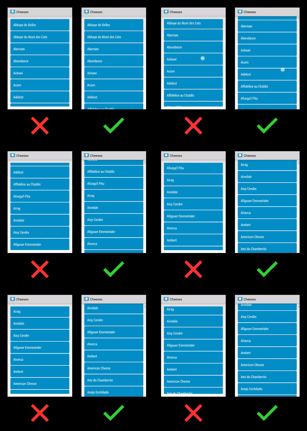
But the training material from android developer site isn’t use an ListView or GridView with ActionBar overlay. When you just follow its instruction to set paddingTop on your ListView or GridView. You may not get expected effect. the scrolling content is just cut from the air. like the left side show on the figure.

To achieve the right effect like the right side. Android Developers Official G+ page give a tip on G+ https://plus.google.com/+AndroidDevelopers/posts/LpAA7q4jw9M
Add an attribute android:clipToPadding to your ListView or GridView and set it false. then you can set your paddingTop on your ListView or GridView as your ActionBar height.
1 | <ListView |